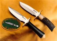
While sheath stamp orientation was fairly consistent with manufacturers, exceptions notwithstanding, it has been brought to my attention and it is questionable whether it was done for "aesthetics" which is currently being promoted in another thread.
The Hesier stamp was put on horizontally because that is the way the logo is read when you turn a sheath over, so that is the natural orientation. No mystery or "it looks better" scenario.
Now the larger RMK football shaped logo was designed for the same orientation and was initially stamped in that fashion. When it was discovered it did not fit well on the old style pancake sheaths of the day supplied with smaller knives such as the 8-4, actually cutting the belt slots with a good whack, the orientation was changed on those models. To keep things somewhat consistent, the change was made at HKL on all models.
When Johnson came on the scene, the sheaths he used as examples had the vertical stamp, and like center keeper snap location, "west" logo stamp orientation, and serif model/length stamps, he followed suit. He continued with the vertical stamp, albeit changed to east, predominately throughout his involvement with RMK.
If the main reason was "aesthetics" as is being promoted, then the change would not have been made on bigger sheaths. If aesthetics were the main issue of the day, the model/length number stamps would be in the same orientation as the logo stamp. That is NOT the case. So I believe it is more of a form follows function scenario.
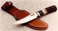
Note that Sullivan's has traditionally stamped all sheaths horizontally with the RMK logo except where space constraints come into play on smaller sheaths and "C" style which are stamped on the front, NOT because of aesthetics.


 Previous Topic
 Index
Index